
How to Choose Between Portrait and Landscape Wall Art
A practical guide to choosing the orientation that suits your wall while allowing the photograph to retain its natural composition.
The Collector’s Guide
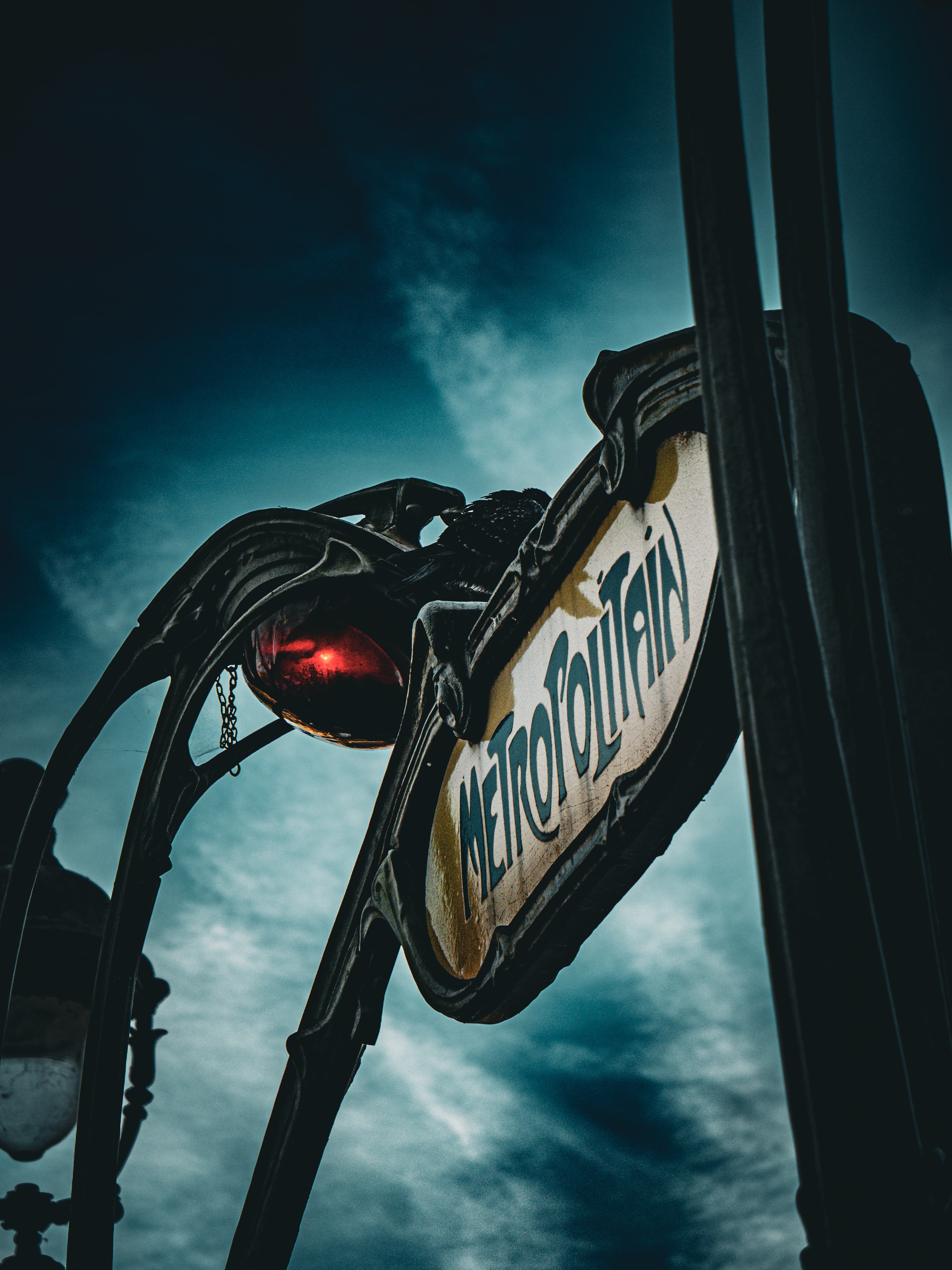
The orientation of a photograph changes the way it occupies a room. A landscape print extends across the wall and creates a broad visual horizon. A portrait print draws the eye upwards and gives a space height, focus and structure.
Choosing between them is partly practical, but it should never mean forcing a photograph into a shape it was not made to fill. The strongest result respects both the architecture of the room and the original composition of the artwork.
Begin with the wall, consider the furniture around it, and then choose a photograph whose natural orientation belongs in that space.
When landscape wall art works best
Landscape-format art naturally suits walls that are wider than they are tall. It works particularly well above a sofa, bed, sideboard, dining table or desk, where the horizontal shape can relate to the furniture beneath it.
The format is especially effective for photographs built around open skies, coastlines, mountain ranges, rivers and city panoramas. Their width allows the eye to travel through the scene rather than settling immediately on one central subject.
A landscape print does not need to span the entire piece of furniture. Leaving clear wall around the frame gives the photograph presence and keeps the arrangement from feeling crowded.
When portrait wall art is the stronger choice
Portrait-format art works naturally on narrower walls, between windows, beside a doorway, above a console or in rooms with generous ceiling height.
It can bring balance to spaces that would make a landscape print feel compressed. A strong vertical composition also encourages the eye to move upwards, which can make the architecture around it feel taller and more deliberate.
Portrait photographs often give greater emphasis to a single mountain, tower, figure or architectural detail. Their narrower field of view creates concentration, making them particularly effective in hallways, studies and quieter corners of a room.
Let the architecture guide you
Before selecting the artwork, look at the shape of the available wall rather than its total area alone.
A long wall above low furniture usually asks for a horizontal relationship. A tall section of wall between architectural features often suits a vertical one. In an open wall without furniture, either orientation may work, but the surrounding doors, windows and sightlines will still influence the balance.
Mark the proposed outer frame dimensions with low-tack tape or paper. View the outline from the entrance to the room and from the position where you will spend most time. The right orientation will usually become clear before the photograph is even in place.
Orientation and print size work together
An A1 portrait and an A1 landscape use the same paper dimensions, but they feel very different on a wall. The portrait creates height; the landscape creates breadth.
At A2, a portrait print can form an intimate focal point on a narrow wall, while a landscape print can sit quietly above a smaller console or desk. At A1, both formats have enough presence to become principal artworks in most domestic rooms. At A0, orientation becomes an architectural decision because the finished print occupies a substantial part of the wall.
Remember that a mount and frame increase the overall dimensions. Measure for the complete framed artwork, not only the paper size.
Never stretch a photograph to fit
A portrait photograph should not be widened into a landscape frame, and a landscape photograph should not be compressed into a portrait one.
Stretching changes the relationships within the image: mountains become broader, buildings lose their proportions and people no longer look natural. Even when the distortion is subtle, the photograph loses its integrity.
LKDWN prints retain their true portrait or landscape orientation within consistent A-series proportions. Where a crop is needed for the final print, it is made deliberately within the composition; the image itself is never distorted.
Consider how the photograph moves
Orientation is not only about fitting a wall. It also affects how the eye moves through the photograph.
A landscape composition often invites a journey from one side to the other: along a shoreline, through a valley or across layers of city architecture. A portrait composition tends to lead upwards or downwards, following a tower, mountain face, street or shaft of light.
Choose the movement that complements the room. A broad landscape can make a seating area feel calm and expansive. A portrait can introduce energy and visual height to a contained space.
What if either orientation would fit?
Some walls can comfortably support either format. In that case, return to the photograph rather than trying to solve the room as a design exercise.
Which image holds your attention? Which atmosphere do you want to live with? The connection to the artwork matters more than achieving a perfectly conventional arrangement.
A thoughtfully placed portrait can be more memorable above a wide piece of furniture than the expected landscape format. A large landscape can bring openness to a tall room. Proportion provides guidance, but the photograph should still be the reason for the choice.
Choose the photograph first, then give it space
The most successful wall art does not feel as though it was selected merely to fill a gap.
Choose the photograph whose place, light or atmosphere continues to draw you back. Then give its natural orientation enough room to work. When the wall and the composition support one another, the artwork becomes part of the architecture without losing its own identity.